















Hebrew Typography: Why Hebrew Letters Work So Well in Design
Hebrew is written right to left, has no capital letters, and in its everyday form omits most vowels. For a designer trained on Latin type, almost every instinct transfers badly. Which is part of why Hebrew lettering has become such a distinctive feature of contemporary Jewish design - it refuses to behave like anything else.
The letters carry more than sound
Every Hebrew letter has a numerical value. Aleph is 1, bet is 2, and so on. This system - gematria - means that any Hebrew word is simultaneously a number, and traditions of interpretation have been built on the connections that produces.
The most familiar example is chai - life - whose letters total 18. That is why donations in Jewish communities so often come in multiples of 18, and why the chai symbol appears on so much jewellery.
The practical consequence for design: Hebrew text is rarely just text. A word placed on a garment carries associations that a translation would lose.
Two families of letterforms
Hebrew typography splits broadly into two traditions.
Square script - ktav ashuri - is the formal, upright form used in Torah scrolls and printed books. It is architectural: strong horizontals, clear counters, a sense of standing still.
Cursive - the handwritten form taught in Israeli schools - is rounder and faster, and looks almost unrelated to the printed letters. Anyone who has learned Hebrew as an adult knows the disorientation of encountering it for the first time.
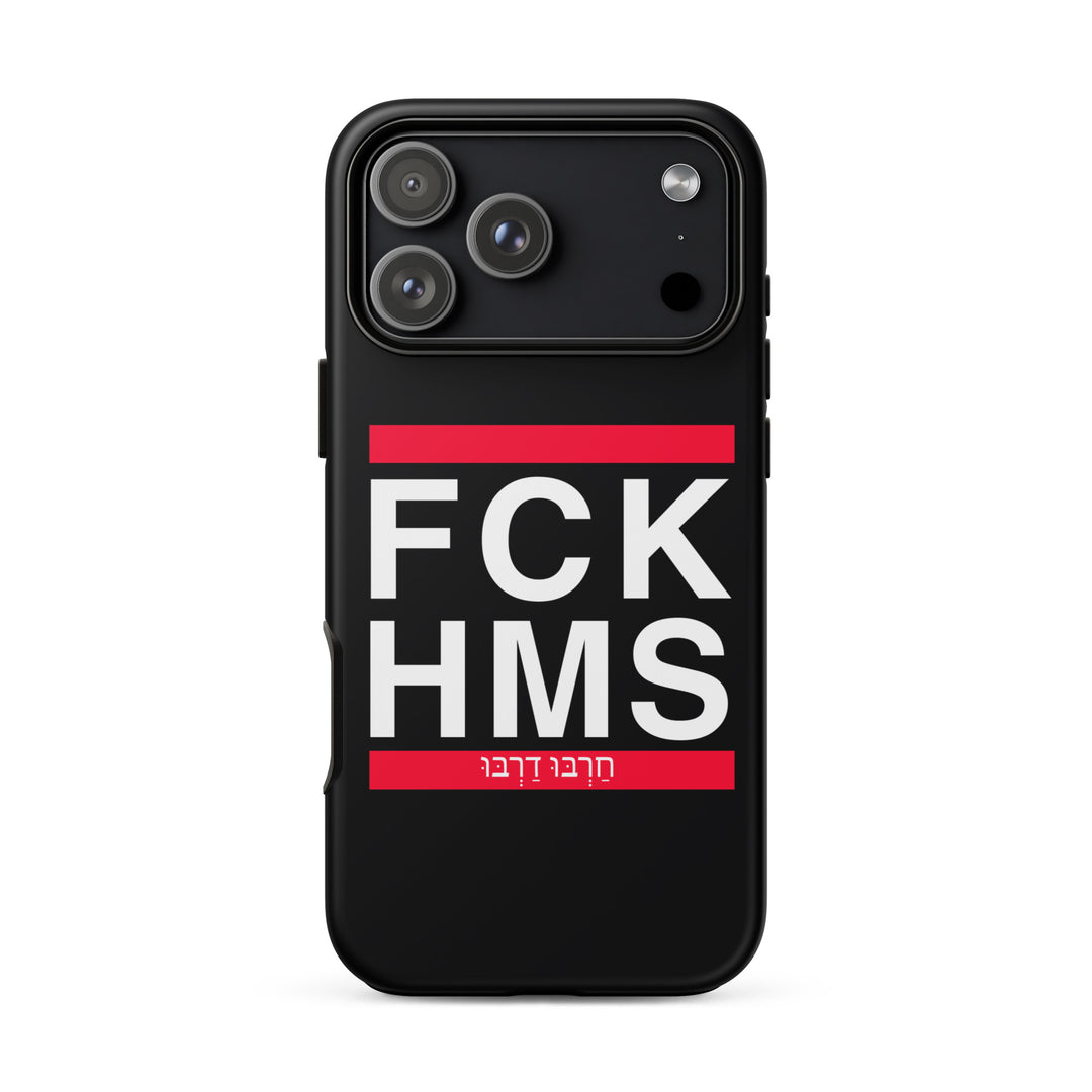
Most apparel design uses square script, because it reads clearly at a distance and carries the weight of the tradition. Cursive shows up where a design wants to feel personal or contemporary.
The vowel problem
Standard Hebrew writes consonants only. Vowels exist as a system of dots and dashes - nikkud - but they are used mainly in prayer books, poetry, and children's texts.
This creates a genuine design decision. Adding nikkud makes a word readable to learners and looks visually intricate, but it clutters a clean design and signals "teaching text" to fluent readers. Omitting it looks cleaner and reads as natural Hebrew, but excludes anyone still learning.
There is no correct answer. It depends entirely on who the piece is for.
Why it works on clothing
Hebrew lettering does something on a garment that English rarely manages: it communicates on two levels at once.
To someone who reads Hebrew, it says exactly what it says. To someone who does not, it reads as pattern - and as a signal that the wearer belongs to something. Both readings are valid, and the ambiguity is part of the appeal.
It is also, quietly, an act of continuity. Hebrew was a liturgical language for centuries before it was revived as a spoken one. Wearing it in public is not a neutral aesthetic choice.
Our Jewish symbols and Hebrew collection works across both letterforms, and the wider streetwear range uses Hebrew alongside contemporary graphic styles.
Getting it right
A few things that go wrong when Hebrew is designed by people who do not read it:
- Reversed text - the classic error, produced by software that assumes left-to-right
- Broken final forms - five Hebrew letters change shape at the end of a word, and a design that ignores this is immediately wrong to any reader
- Wrong-direction wrapping - multi-line Hebrew that breaks as though it were English
- Decorative distortion - stretching or skewing letters until they become a different letter entirely
Every one of these is invisible to a non-reader and glaring to a reader. Which is exactly why they matter.
The short version
Hebrew letters are not an ornament borrowed for effect. They are a working writing system with three thousand years behind it, and they reward being treated that way.